- Published on
🛑 Stop resizing your browser: improve testing for responsiveness
- Authors

- Name
- jen chan
This is an expanded thinkpiece around a lighning talk I did at TorontoJS on April 30, 2024. 👉🏻 Slides here
TLDR; use device mode on browser devtools to accurate emulate the experience on mobile and tablet devices.
A familiar story

You learn that you have one week to rewrite the frontend for an app and you're given incredibly high fidelity designs.
After confirming that the designs are mobile-first, you agonize over the breakpoints.
Then come time for business review or quality desk checks, and you notice your colleagues resizing the browser, then mentioning that things don't look right on tablet or mobile.

This behaviour is really problematic for testing complex UIs.
When you resize your browser, you're not testing for responsiveness. You're testing the side effect of how a layout looks when you resize a browser.
Browser resizing won’t account for 👇🏻
Viewport height
This won't match the visual viewport height of the actual devices you'd hope to test on. Chrome on Android and iOS is notorious for having a slippery viewport height that doesn't match the understanding of
100vhin CSS.Zoom level
Depending on what the developer wrote into the meta viewport tag, the browser is not going to zoom reliably. Zooming changes the width of the visible viewport according to device pixel ratio. For example, zooming in 150% from 1440px on a Macbook Pro with a device pixel ratio of 2 will give you a viewport width of 960px.
Touch event emulation
There's are no hover or click events on touch devices.
Orientation
The transition or initial load in portrait or landscape mode won't be captured.
User agent strings
These are the series of headers that a browser sends to the server with information about the particular device and operating system that the browser is running on.
So for example, if someone is using Safari on iOS 12 and iPhone 8 and the product specifically has a banner for iOS asking users to use Chrome, you might miss that.
Device pixel ratio
This is the relationship between the resolution and the way in software, pixels are drawn on a screen.
Between Hardware resolution pixels, Device pixels, and CSS pixels
We commonly think of a pixel as one point of light on a screen or a dot on print, but how it's drawn differs between media.1
The W3 CSS3 spec defines a pixel as:
the visual angle of one pixel on a device with a pixel density of 96dpi and a distance from the reader of an arm's length.
So there's a physical basis to CSS pixels but it's unhelpful for our purposes since most top-of-line devices and screens today come in all kinds of resolutions, most of higher density than 96dpi.
The spec explains there's 2 ways a pixel can be made apparent for us developers:
For a CSS device, these dimensions are anchored either:
- by relating the physical units to their physical measurements, or
- by relating the pixel unit to the reference pixel.
Alternately, we can think of the CSS pixel as something developers use when developing software for browsers when it comes to defining breakpoints for our viewports.2
Lo and behold, the spec defines the device pixel to refer to the smallest physical unit of a screen". Such pixels are usually constituted by subpixels of red, green and blue. On screens with aspect ratios like 16:9, these pixels are even rectangular!
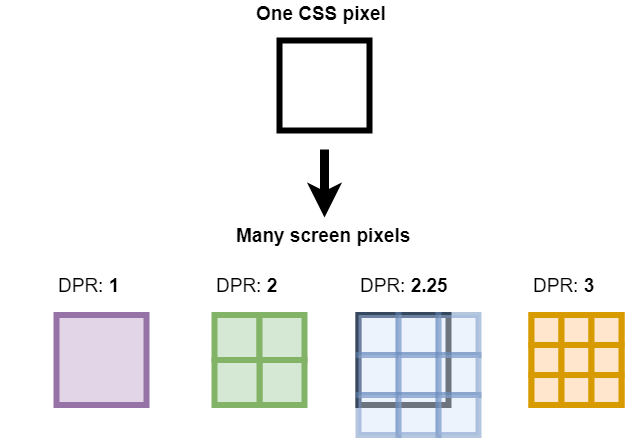
Higher density display screens have way more hardware pixels than the standard 96dpi, so through some magical downsampling or supersampling, the browser uses device pixel ratio to jam more pixels into 1 CSS pixel.
And that’s how a device with purportedly 750 x 1336px resolution with a device pixel ratio of 2 can still be targeted by a media query of 320px through 600px!

Pro tip: you can actually just type window.devicePixelRatio into your browser console to get the device pixel ratio of the screen you're on. Web APIs 💖
Unintended reflows and re-renders
Narrowing the browser in complex UI with listeners also invokes reflows and re-renders which don’t represent the initial page rendering on device browsers.
If you’re using components with observers like ResizeObservers in carousels, you trigger events and side effects that would otherwise not happen if a user initially loaded the page on a mobile device.
Example: Wayfair's Bed and Bath Category page
Here's an example with Wayfair's Bed and Bath category page –I have no affiliation or ref-links with them; it's just so I'm not using an example from my paid work where I first discovered this disrepancy.
In the gif, you'll see that resizing down will lead to the horizontal layout of categories being cut off. However, if you were to load the page in Chrome devtools, you'd see that the nav items are stacked.


The viewport meta tag
You might recognize this piece of markup found in the document head of websites. It tells the content of the browser to render according to device-width with an initial zoom scale of 1.
<meta name="viewport" content="width=device-width, initial-scale=1">
You won’t leverage this native capability unless you load your page in the device width in your browser devtools.

Improved approaches to testing responsiveness
1. Free tools for dandy visual testing
If you're lazy (or more likely under tight timelines), you can use tools like Responsively or ResponsiveTestTool.com, or browser extensions like Responsive Viewer will enable quick visual previews across multiple devices at once.
I personally like Responsively for visual testing as I develop when I don't have any paid options as I'm able to also capture multiple snapshots across many devices at once.
Note that while these tools are great for quick visual checks, they won't simulate device CPU or network speeds.
2. Use device mode on browser devtools
This is a first-order approximation of device responsiveness. You can simulate different devices, orientations, touch events, and zoom levels, and to some extent, you can even throttle the connection and simulate the network and CPU speeds of older devices.
Things like this give you an idea of initial page load speeds and interaction to next paint (INP) (how scripting as a result of async events affect the ease of page interactivity).
As a rule of thumb, performance should be of concern if it affects user experience or has a negative impact on business cost.
3. Use a device emulation service like BrowserStack or SauceLabs
Nothing is really as good as testing on an actual device running a browser, but as developers we never have enough time to try every device.
Platforms like Browserstack or SauceLabs offer virtual instances of real devices and browsers for manual and end-to-end testing. Caveat: subscriptions cost money and are on a per-seat basis.
With Android devices, you can test Chrome on different emulated Android devices with Android Studio's emulator.
You can also read about that time I trolled the internet for free device testing in order to test on IE11.
4. Automate visual regression testing as part of CI


If you’re working on a design system or component library, then automating your unit tests and having visual regression snapshot tests chained up in a pipeline gives you full confidence your front end is behaving as it should!
With this approach, you can catch visual bugs and update the baseline for tests before they hit production. Regardless of whether they're automated, you'll still need a human to write unit tests and to validate what is considered a regression and not just further implementation of design changes.
Next time you're testing for responsiveness, remember that resizing your browser is not the same as testing on a mobile device.
Footnotes
There's a history of thought on this topic due to the freakout around responsive design introduced by the iPhone 3. I really recommend reading "A pixel is not a pixel is not a pixel" and "A tale of two viewports" by Peter Paul Koch. ↩
This demo by Dan Rodney is one of the best I've seen on the impact of device pixel ratio on image rendering. In case you're worried, today it's possible to export at 1-3x density from Figma and to use the
srcsetattribute in HTML to serve the right image to the right device. ↩
📝 9 comments • 💖🔥🦄 62 reactions on Dev.to

